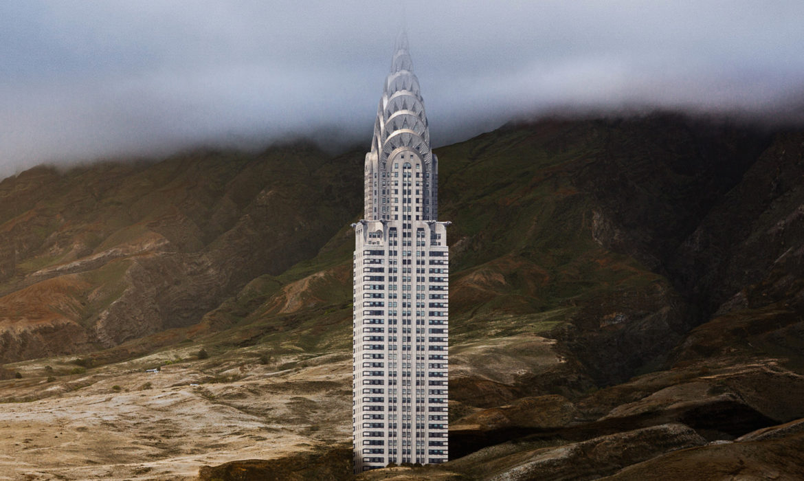
A graphic design project by Anton Repponen. New York’s iconic buildings set in deserts, natural oases and Martian landscapes
Have you ever thought of a building you know really well, abstracted it and put it into a context that was radically different from its original site? Like in dreams, where objects, faces and places can take on a totally different meaning than the one they actually have. This is the concept underlying “Misplaced”, a visionary graphic design project by Anton Repponen, an interaction designer based in New York with a background in architecture.

Looking at his works you will “discover” that the United Nations building, designed by Oscar Niemeyer and Le Corbusier, is no longer in New York but smack in the middle of a desert. The same fate has befallen Renzo Piano’s Whitney Museum, which instead of overlooking the Hudson river, is set on a barren hilltop marked by the passing of time. Eleven buildings in all, which define the New York skyline, are transported into a natural landscape. The work is the result of a long and meticulous process of photography first, and editing later: « the building that is represented in each image, explains Repponen, is the result of many different shots. The Breuer building is a perfect example: the left corner comes from a photo I took on a different day than the photo of the opposite corner of the building. The editing is conceived to unite the various components, after which I eliminate the shadows and the lines that reflect external factors to represent the structure in its original form, the way it was conceived by its designer».
This is precisely the goal of the young designer: to show these landmarks by extrapolating them from their usual context, which inevitably modifies the perception of the world-renowned volumes, some of which were the setting for history in the making.

And so we can enjoy details we may never have perceived, as if it were the first time we stopped to look at them. «There are so many beautiful buildings in the city, underlines Repponen, which often quickly lose their appeal because of their surroundings. Paradoxically, the same activities that were generated by their construction negatively influence the aesthetic impact of these iconic buildings within the city’s landscape.»
Completing this graphic design project are the descriptions of each of the eleven structures written by Jon Earle, a Brooklyn copywriter, as if he were working on a tour guide. They are not “simple” explanations, but rather “invented anecdotes and stories that enhance the sense of humour, the absurd and the mystery behind the project, says Repponen. They are like scenes out of a movie that was never made, ideal images to tell a story that would make no logical sense».


© ALL RIGHTS RESERVED
translation by Olga Barmine