The history of the public image of urban centres and the projects by the Edenspiekermann firm are the protagonists of an exhibition that is part of the celebrations for Parma Italian Capital of Culture 2021
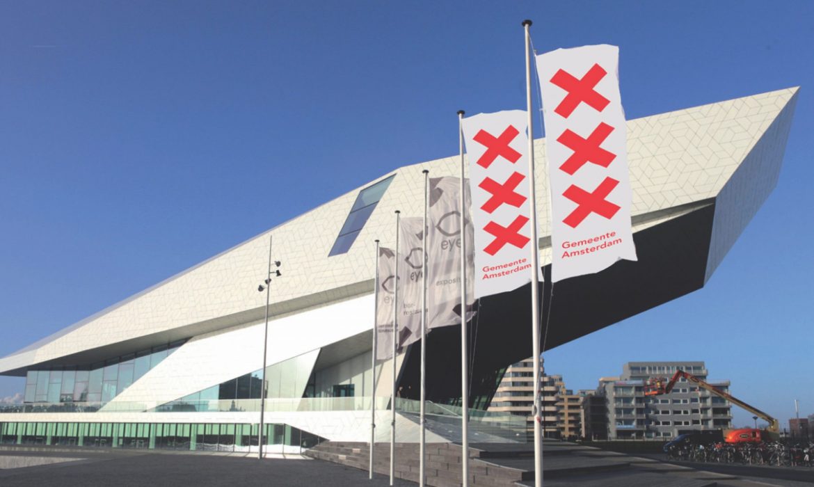
Raise your hand anyone who has been to Manhattan and never worn, bought or brought back a piece of clothing or an object with the slogan “I Love New York”, featuring the heart and the letters NY. Or did not come back from Amsterdam without the three red crosses (XXX) burned into their memory, inspired by the fifteenth-century coat of arms of the Dutch city and visible all over the city centre. Or, without a gadget (or at least a photo) with the logo “Porto.”, rigorously with a period, after visiting the city in Portugal.
These are now classic “brands” that can catalyse the attractive energy of the cities they represent, defining the visual identity of these urban centres with specific extensions and applications. The narration of places and the public image of the city using an effective branding system has continued to develop in recent years to respond to the need to build a shared regional identity, aiming at citizen «participation», with the purpose of generating an economic and social impact on the urban fabric: this phenomenon is the object of the exhibition that was recently inaugurated in Parma, complete with a catalogue featuring images, examples and case studies focusing on city branding.
For the celebrations of Parma Italian Capital of Culture 2021, an exhibition project was developed titled “You Are Here. City Branding: the Italian scenario and projects by Edenspiekermann for Amsterdam, Santa Monica and Parma”, promoted by Csac study centre and communication archives of the University of Parma and produced by the Committee for Parma 2020, organized by Electa.
The exhibition, inaugurated on December 16th and open through April 18th, is being held in the spaces of the Abbazia di Valserena, at the university in Parma, and explores the idea of city branding, offering visitors, as the presentation notes read, “significant examples of an important contemporary phenomenon that is developed in various research environments, from marketing to city planning, from social sciences to design, with the purpose of exploring the communication strategies involved in building the visual identity of a city”.


The theme of the public image of the city, in particular, is developed in three sections: the first analyses the case of Parma; the central section of the exhibition is titled “Destination Italy” and gathers 32 case studies for the corporate image of Italian cities (from Ascoli Piceno to Bari and Cagliari, from Bologna to Courmayeur, from Rome, Florence and Genoa to Gabicce Mare, Latisana, Lignano Sabbiadoro or Sabbioneta); the third section, finally, exhibits two international projects – Amsterdam and Santa Monica – developed by the design firm Edenspiekermann.
The exhibition is accompanied by a catalogue published by Electa, which reviews and analyses the genesis of the case studies selected for the exhibition. «There has been a significant evolution in city branding since the early approaches, which considered a city’s brand as an essentially economic element, with its own value ‘equivalent’, in a certain sense, to a product brand, explains Gianni Sinni, co-author of the volume (with Amedeo Palazzi and Edenspiekermann) and professor of Industrial Design in the Department of Design Culture at the Iuav University in Venice.
Today, on the other hand, we tend to frame it primarily within a social perspective, through more or less participated processes to share in the processes for building the brand». It should be noted, in fact, that a branding operation, especially if imposed from above, «can also be ‘rejected’ by the citizens of that city: for example the case of Venice, in the early 2000s, which did not work. But Rome too, which twice tried to create a true brand and which, as of today, only has institutional communication, but not a real city brand».
What is, therefore, the key to the success for a city brand? In one word, says Sinni, «it’s participation, the capacity to involve the citizens».
«The brand today is increasingly only the visible part of a process of economic and social development that precedes the design of a graphic model».
The visible effect on the community of a successful brand «is the fact that it is used autonomously by the citizens, independently of the administration». The classic example is the “I Love New York” brand, with which the citizens of the Big Apple identify in general. But there are many other cases that vary in degree.


Hand in hand with the awareness of the need to represent an increasingly varied complexity of identity, such as those that characterise contemporary cities, concludes the professor, «city branding seeks, in some cases, to identify not univocal symbols, but systems» that can respond to this need for versatility. This is the case with Bologna, where the decision was made to build a (software) language managed by an algorithm, «that will allow anyone, choosing one word, to build a personal coordinated city brand, developing all different elements».
One of the examples on which the exhibition and catalogue focus is the work by the firm Edenspiekermann, founded by Erik Spiekermann, one of the most renowned graphic and font designers in the world, for the cities of Parma, Amsterdam and Santa Monica. The presentation of the design process that led to the ideation of Parma’s city brand, when it was named Capital of Culture 2020, illustrates the use of Zuzana Licko’s interpretation of the Bodoni filosofia font.
Whereas Amsterdam and Santa Monica reveal two different approaches to the theme: the former relies on the use of a shape alphabet, a system of shapes designed to be added to the three red crosses of Amsterdam inspired by the city’s fifteenth-century coat-of-arms; the latter illustrates the proposal for the city in California, «a concept adapted to an administration seeking an experience of identity and open to digital services», with the creation of an umbrella brand for the various city departments.
Cover: Amsterdam ©Edenspiekermann
Translated by: Olga Barmine
© ALL RIGHTS RESERVED